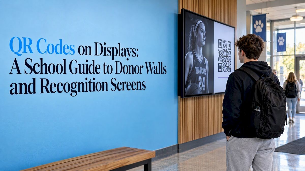
A QR code on a school display works when it does one job: it moves a visitor from a moment of pride in the lobby to something on their own phone, such as a full athlete profile, a donor story, or a giving page. It fails when it is too small, appears for two seconds, or points to a page that is hard to read on a phone. This guide covers what to link to, where to place the code, and how to keep it accessible, safe, and measurable on donor walls, halls of fame, and other recognition screens.
Touchstone-dstouchstone-ds.comBring School Achievements to LifeTouchstone helps schools turn academic and athletic accomplishments into interactive digital displays that celebrate milestones and connect their community.Explore digital recognition displays
TL;DR
- Use one QR code per screen or slide, with one clear action and a short line telling people what they get when they scan.
- Link to a page built for phones that you control: a profile, a story, an event page, or a giving page.
- Give the code room: strong contrast, blank space around it, a size matched to viewing distance, and eye-level placement where people already pause.
- Plan for accessibility and security from the start, including a text alternative and a destination on your own domain.
- Track scans so you know which displays earn engagement, then adjust.
Table of Contents
- Why QR codes belong on recognition displays
- What the code should link to
- QR codes on donor walls
- Placement, size, and timing
- Keeping slides readable around the code
- Accessibility: the code is never the only way in
- Security: make your code easy to trust
- Measuring whether it works
- Bring it together with a digital recognition display
- FAQ
- Sources
Why QR codes belong on recognition displays
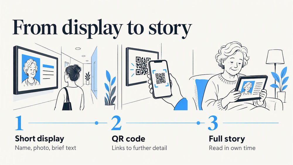
A display can only hold so much. A hallway screen shows a name, a photo, and a line or two of text. Behind every name there is usually more: a season record, a scholarship story, a gift that built a new lab. A QR code is the bridge between the short version on the wall and the long version a curious visitor can read in their own time.
Higher education already works this way. East Tennessee State University’s digital signage guidelines recommend short slides built around a headline, date and time, location, and a QR code for further detail. They list academic competition results, student and faculty achievements, and awards among the content that fits. The reasoning is simple: viewers may not stop to read a dense slide, so the slide earns attention and the code carries the depth.
Physical displays have used the same trick. A NISOD-published case study describes Lehigh Carbon Community College using QR codes on a physical documentation panel to connect photographs and program information to college media, brochures, awards, grants, and project details. Because the codes sat on flaps that linked to online content, the content could be updated more easily than the panel itself. Students, prospective students, and community visitors could scan with their own phones or with department-loaned iPads.
That last detail matters for schools. Not every visitor will have a phone out, and not every visitor wants to use one. A QR code should extend a display, never be the only way to get the value from it.
What the code should link to
The most common mistake is sending every scan to the school’s home page. Match the destination to what the visitor just saw. Someone looking at a record-holder wants that athlete’s story. Someone looking at a donor name wants to understand what the gift did.
| Display | Best destination | Why it works |
| Athletic hall of fame | Full inductee profile with career stats, photos, and video | Extends the short bio on screen |
| Record board | Record history, past holders, and the season it was set | Gives the context behind a number |
| Donor wall | Story of the gift or fund and what it made possible | Connects the name to the impact |
| Donor wall (giving) | Mobile giving page for the same fund or campaign | Turns inspiration into action while it is fresh |
| Yearbook or archive display | The digitized page or full volume | Lets alumni keep browsing at home |
| Event or awards screen | Event page with time, place, and directions | Fits the headline, date, and location slide format |
One principle holds across all of them: one code, one action. If you want visitors to both read a story and donate, put the story first and place a clearly labeled giving link on that page. Two competing codes on a single screen split attention and make people hesitate.
If you are choosing which achievements to feature in the first place, our list of achievements for an academic wall of fame is a good starting point, and each one is a candidate for a deeper profile behind a code.
QR codes on donor walls
Donor recognition is where QR codes do the most work, because donors care about two things: being thanked well, and seeing that the gift mattered. A plaque or a static list can do the first. A scannable story does the second.
Here is how we suggest schools approach it.
- Decide the job of the wall. Is it recognition only, or recognition plus a path to giving? Both are valid, but the answer shapes what the code links to.
- Link recognition to impact. A donor’s name on screen, with a code that opens a short page about the scholarship, the equipment, or the renovation they supported, tells that donor and every visitor that giving leads to something real.
- Keep the giving path separate and clear. If you want a giving code, label it plainly and send it to the page for that specific fund, not to a generic form.
- Write for a phone. Short paragraphs, a large photo, one button. Visitors are standing in a hallway, often on a cellular connection, so a heavy page loses them.
- Make updating easy. Donor lists grow every year. The wall and the linked pages should be edited from one place so a new name never waits on a reprint.
That last point is a core reason schools move from engraved plaques to a digital donor wall. Our platform is built around cloud-based content management and real-time updates, so adding a donor, correcting a name, or refreshing a story does not mean ordering new hardware or new metal.
Making it mobile friendly
A mobile-friendly donor wall is really a mobile-friendly destination. The wall invites the scan, and the phone page delivers the experience. Check these basics on every linked page:
- It loads fast on a cellular connection, since many school lobbies, gyms, and stadium concourses have patchy service.
- Text is readable without pinching and zooming.
- Buttons are large enough for a thumb.
- There is no login or account creation before the visitor sees the content.
- The page works in both portrait and landscape.
Test on an older phone as well as your own. If a page is slow for you in the actual spot where the display hangs, it will be slow for visitors.
Placement, size, and timing
A code that cannot be scanned is decoration. Four things decide whether it can.
Size and distance
The farther away a visitor stands, the larger the code must be. A screen in a narrow hallway can carry a small code. A screen in a large atrium or gym lobby needs a bigger one, or it needs to be placed where people naturally come close, such as beside a seating area or a doorway. Stand where visitors will stand, hold up a phone, and see whether it scans without effort.
Contrast and blank space
Use dark code on a light background, or the reverse only if you have tested it, and leave a clear border of empty space around the code. Do not place logos, text, or photos over the pattern, and keep animated backgrounds behind it still. Scanners need a clean edge to find the code.
Height and location
Place the code at roughly eye level, where people already stop: near seating, at a hallway junction, outside a trophy case, by the athletic office. A code mounted at the top of a tall wall display is hard to scan. On a touchscreen display, the code should sit within easy reach of the screen’s main content, not in a corner people never look at.
Time on screen
For rotating screens, the code has to stay visible long enough to scan. Keep it on screen for the whole slide, not as a flash at the end, and give people a few seconds to aim. On interactive touchscreens this is easier, because the visitor controls the pace and the code can remain on a profile page for as long as they are reading it.
Tell people what they get
A bare square gives no reason to act. Add a short line next to it, such as “Scan to read Maria’s full story” or “Scan to see the record history.” Add a short backup web address in readable type for visitors who cannot or prefer not to scan.
Keeping slides readable around the code
The slide around the code matters as much as the code itself. Crowded layouts push the code into a corner and bury the line that explains it. A good rule is to show only the essentials on the display (who, what, when) and let the code carry everything else. Design guidance for printed signage says much the same: these signage design guidelines stress readable layouts and avoiding costly reprints, and the same discipline helps digital slides stay clean and scannable.
If your campus runs several screen types, it also helps to keep the code in the same spot from slide to slide. Visitors learn quickly where to look. Our guide to school digital signage benefits covers how recognition screens fit alongside announcements and schedules.
Accessibility: the code is never the only way in
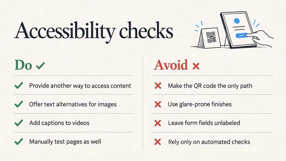
Schools are public-facing institutions, and recognition displays should work for everyone who walks past them. A QR code asks the visitor to own a smartphone, hold it steady, and read a small screen. Some visitors cannot do that comfortably, so plan an alternative path for every code.
The U.S. Department of Justice’s ADA web guidance is clear on what a linked page should offer: text alternatives for images, captions for videos, sufficient text contrast, labeled form fields with clear error instructions, support for browser zoom, proper headings, and keyboard access. It also recommends manual testing alongside automated checks. Those are exactly the things to confirm on every page a code opens, especially a giving form.
The ADA also sets a broader expectation. According to a Department of Justice fact sheet, the law requires people with disabilities to have full and equal enjoyment of goods, services, and facilities, including those offered through the web, and requires effective communication. For a school, that translates into a simple practice: whatever a visitor can learn by scanning, there should be another way to learn it, such as the information on the touchscreen itself, a printed card at the front office, or a staff member who can help.
The physical display has its own considerations. The U.S. Access Board’s guide to signs says signs must meet visual requirements for people with low vision, with non-glare finishes and light-on-dark or dark-on-light contrast. It also notes that electronic signs raise distinct considerations and that the ADA Standards do not specifically address them, while the ICC A117.1 standard provides technical specifications for variable-message and audible-sign systems. The Access Board’s technical chapter on communication elements adds that screens such as ATM and fare-machine displays must be visible from 40 inches above the center of the clear floor space and use sans-serif characters. Those requirements are written for specific equipment types, but they are a sensible benchmark for choosing glare-free screens, readable typefaces, and mounting heights for any interactive display. For decisions about your own building, ask your district’s ADA coordinator or counsel.
Security: make your code easy to trust
A QR code is only a link, and anyone can print a link. NIST’s security-awareness material warns that QR codes can hide phishing links and may be placed in public locations, and advises people not to interact with unsolicited codes. For a school, the risk is a sticker placed over your code, sending visitors to a fake giving page.
A few habits protect your community and your donors:
- Link only to pages on your school’s own domain, and say so in the backup web address printed near the code.
- Keep the code inside the display itself, behind glass or in the screen content, rather than on a loose sticker or flyer anyone can swap.
- Check the wall regularly, the same way you check for damage or outdated content.
- Never ask for sensitive details on the first page a code opens.
- Make the origin obvious with school colors, logo, and name on the landing page, so visitors can judge the source at a glance.
Public screens deserve the same care on the hardware side. Our practical guide to kiosk security for schools covers locking down a touchscreen so visitors can use what you intend and nothing else.
Measuring whether it works
A code you cannot measure is a code you cannot improve. The Lehigh Carbon Community College team in the NISOD case study planned to evaluate its display by counting QR scans and link access, a model any school can copy.
A simple approach:
- Give each display its own destination address (or its own tracking parameter) so you can tell the lobby wall from the gym wall.
- Review scans monthly, and compare against events: a homecoming weekend, a signing day, a donor appreciation night.
- Look at what visitors do after they land. Did they read the profile to the end? Did they tap through to giving?
- Change one thing at a time, such as the line of text beside the code, the placement, or the landing page, and see what moves.
- Test every code before it goes live and again after any content change.
Low numbers are information, not failure. A code that few people scan usually has an unclear invitation, a poor location, or a slow page, and each of those can be fixed.
Our perspective
We build digital halls of fame, donor walls, and record boards for schools, and we think of the QR code as a supporting actor. The star is the display: an interactive touchscreen that people walk up to, touch, and explore. A well-designed screen already holds the full profile, the photos, and the story right where the visitor is standing.
So where does a QR code earn its place? It lets someone take the moment with them. An alum sharing a profile with a teammate across the country, a parent saving a page to read later, a donor revisiting the story of their gift from home. That is why we design for multi-device access, with content that lives in the cloud and updates in real time, so the page behind the code is always as current as the screen in the hall.
Our approach comes from a family-run team that works directly with schools, with interface design shaped by gaming industry UI/UX designers and Emmy-nominated visuals. Recognition should feel as good as the achievement it honors. A code that opens a slow, cluttered page undercuts that. A code that opens a clean, branded, thoughtful story completes it.
Gardner Gendron
Bring it together with a digital recognition display
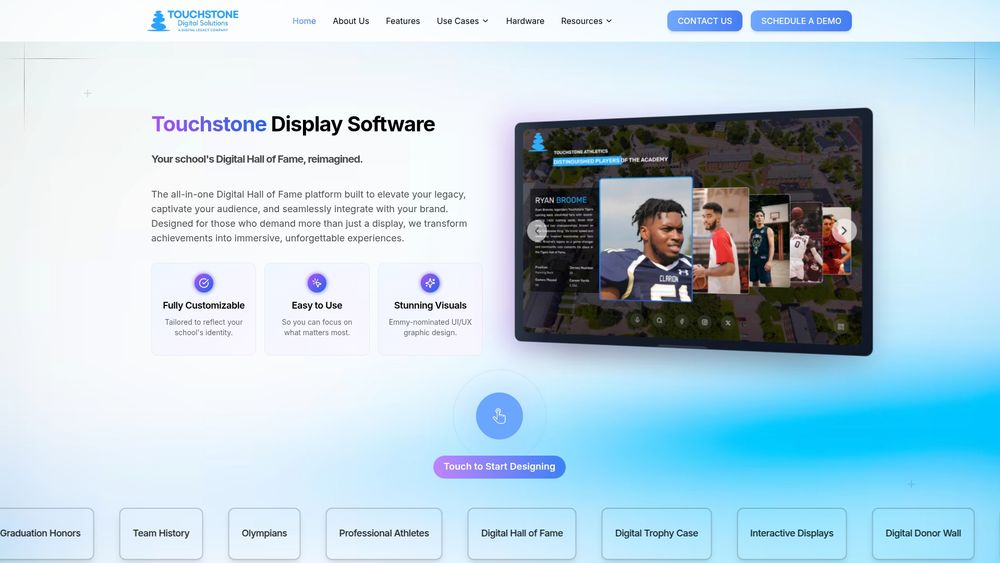
If you are planning a new recognition space, or replacing plaques and static boards that are hard to update, start with the display and add scannable extensions where they help. Our Touchscreen Software powers halls of fame, donor walls, record boards, trophy cases, yearbooks, and archives, with fully customizable branding so the display looks like your school and not like a template.
Our published hardware bundles are a one-time purchase: the Wall Mounted Touchscreen Bundle is $3,100 to $4,900, and the Floor Standing Touchscreen Bundle is $3,550 to $4,300. Software and service pricing is quoted for your project. We handle implementation with you from the start, and our team stays involved with dedicated support and continuous updates. To talk through your space, visit Touchstone Digital Solutions.
FAQ
Should every school display have a QR code?
No. Add one where there is more to say than the screen can hold, such as a full athlete profile, a donor story, or an event page. On interactive touchscreens, visitors can often explore the whole profile on the display itself, so a code is mainly useful for taking content home or sharing it.
What should a QR code on a donor wall link to?
Match the destination to the intent. For recognition, link to a short, phone-friendly page about the fund or gift and what it made possible. For giving, link to the page for that specific fund. Keep one action per code so visitors are not forced to choose.
Are QR codes on public displays safe?
They are safe when you control them. NIST’s security guidance warns that QR codes can conceal phishing links, so keep codes inside the display rather than on stickers, link only to your own domain, print a short backup address, and inspect the wall regularly for tampering.
How do I make QR codes accessible?
Never make the code the only route to information. Offer the same content on the screen itself, at the front office, or through staff. On the linked page, follow the Department of Justice’s web guidance: text alternatives for images, captions, strong contrast, zoom support, and keyboard access.
How do I know if people are scanning?
Give each display its own destination or tracking parameter, then review scan counts monthly alongside events and campaigns. Test the code before launch and after every content change.
Sources
- Guidelines for Digital Signage, East Tennessee State University
- Using QR Codes as Communication and Documentation Tools in Higher Education, NISOD
- Guidance on Web Accessibility and the ADA, ADA.gov
- U.S. Department of Justice Fact Sheet on web accessibility
- Chapter 7: Signs, U.S. Access Board
- Chapter 7: Communication Elements and Features, U.S. Access Board
- Security awareness newsletter, NIST
- Signage design guidelines