A good interactive display passes one test: a visitor walks up, understands what to do within seconds, and finds something worth staying for. Everything else, from fonts to gestures to the height of the screen, serves that test. This guide walks through the principles that make school touchscreens work, whether the screen holds a Hall of Fame, a donor wall, record boards or a digital yearbook.
Touchstone-dsMake School Achievements Easy to ExploreTouchstone creates customizable digital Hall of Fame experiences that celebrate school achievements through interactive touchscreen displays.Explore Touchstone displays
TL;DR
- Design for zero-trial learning: a visitor should understand the screen after a few seconds of watching someone else or touching it once.
- Keep navigation visible and shallow. Hidden menus, long scrolls and deep jumps lose people who have no reason to learn them.
- Put the most important touch targets within reach (15 to 48 inches off the floor under the ADA) and keep text large, high-contrast and plain.
- Treat content as a strategy, not an upload: lead with your best stories, then let visitors explore by person, year, sport or program.
- Plan the room as carefully as the interface: lighting, glare, traffic flow and mounting height decide whether a great design gets used.
Table of Contents
- Start with the visitor, not the screen
- Core interaction design principles that apply to every touchscreen
- Design the attract screen and the first five seconds
- Navigation: shallow, visible and forgiving
- Touch gestures: keep them simple and consistent
- Content strategy: what goes on the screen
- Accessibility: design for every visitor
- Environment and hardware: where the design meets the room
- Common mistakes to avoid
- Our perspective on interactive display design
- Put these principles to work with Touchstone
- FAQ
- Sources
Start with the visitor, not the screen
Most people who touch a school display are not there to use software. They are waiting for a parent, walking between classes, attending a game or visiting campus for a reunion. They have limited time and little incentive to learn anything new.
That is the core idea behind “immediate usability” in the CHI 2001 research on kiosk design. The authors argue that public systems need zero-trial learning: people should be able to use the interface after watching others or after a brief try (roughly 15 to 60 seconds), with the simplest practical interface and visible affordances whose results are immediately apparent.
For a school, this means you design for three kinds of visitors at once:
- The student who will tap everything in ten seconds and walk away.
- The alumnus who comes back after 30 years and wants to find one name.
- The parent or guest who has never seen your school and wants a sense of its story.
If the first screen serves all three, you are on the right track.
Core interaction design principles that apply to every touchscreen
Interaction design has a long list of principles, and they overlap. OpenLearn’s introduction to interaction design groups them around perceivability, consistency, affordance and constraint, and feedback. Here is what each looks like on a school display.
Perceivability: make everything easy to see
People experience an interface through their senses first. On a wall-mounted or floor-standing screen, that means large type, strong contrast between text and background, and a clear visual hierarchy. One headline, one image and one obvious next step beat a screen full of equal-weight tiles.
- Use one typeface family, with a serif or sans serif chosen for legibility at a distance.
- Keep body text short. Visitors read a screen standing up.
- Leave generous whitespace so photos and names can breathe.
Consistency: teach once, use everywhere
People rely on consistency to interpret and predict what happens next. If a back button sits in the lower left on one screen, it belongs in the lower left on every screen. If tapping a photo opens a profile in one section, it should do the same everywhere else. The same goes for gestures, colors for tappable items and the language of your labels.
Affordance and constraint: show what can be touched
An affordance is a visual clue that something can be interacted with: a button that looks like a button, a card with a visible edge, an arrow that suggests a swipe. Constraints do the opposite job and limit what can go wrong, such as graying out options that do not apply. The CHI kiosk guidelines advise against hidden functionality, including menu bars, because visitors will not go hunting for it.
Feedback: confirm every touch
When a visitor taps, something should happen right away: a highlight, a subtle motion, a sound if the space allows it. Feedback signals that an interaction has occurred. A screen that pauses without response teaches visitors to give up or to jab at it repeatedly.
Keep each step self-contained
One of the first principles of interaction design is to bring users the information and tools needed for each step, so they do not leave the current screen to hunt for what they need. On a Hall of Fame, a profile should show the inductee’s photo, years, achievements and a way to see related people without a trip back to the home screen. The same source also stresses giving users autonomy within boundaries rather than infinite freedom, which is a good description of a well-built touchscreen menu.
Design the attract screen and the first five seconds
A display that sits idle looks like a dead monitor. The first screen must do two jobs: attract attention and tell people how to begin.
The CHI kiosk guidelines recommend an attract sequence tailored to the audience that clearly indicates how to start, with a plain prompt like “Touch screen to begin,” and they advise removing splash screens that make visitors wait. In a school, an attract loop might cycle through a few striking photos of recent inductees, a championship moment and a historic image, with a clear prompt layered on top.
A few practical rules:
- Show motion or change on the idle screen so people notice it from down the hall.
- Put the call to action in plain words, large and in a consistent place.
- Return to the attract loop after a reasonable period of inactivity so the next visitor never inherits someone else’s deep-dive screen.
- Skip logos and intro animations that delay the first tap.
Navigation: shallow, visible and forgiving
The same CHI paper warns against scrolling and jumping between sections in public interfaces, since visitors have little time or incentive to learn them. Translate that into school-friendly navigation:
- Limit the home screen to a handful of clear entry points, such as by sport, by decade, by honor and a search box.
- Keep any path to a profile within three taps.
- Make “Home” and “Back” permanent and obvious.
- Replace long scrolling lists with paged or filtered views where each tap leads somewhere meaningful.
- Offer search for the visitor who knows exactly who they want, with a large on-screen keyboard.
Touchstone’s Digital Athletic Hall of Fame and Digital Record Boards are built around this sort of browse-by-category thinking, so a visitor can move from a name to a team to a season without feeling lost.
Touch gestures: keep them simple and consistent
Tapping is universal. Swiping is familiar. Pinching, rotating and multi-finger drags are less reliable on a shared public screen, especially when the audience includes elementary students.
The Soni et al. (2019) recommendations for children’s touchscreen interfaces are a useful reference for any school display. They suggest:
- Avoid flick, drag-and-drop, rotate, pinch and spread gestures for very young children (under age 4).
- Avoid double tap for children age 5 and under, or allow a longer delay between taps.
- Enlarge active areas so slightly out-of-bounds touches still count.
- Use gestures consistently throughout, and allow partial gesture completion because keeping a finger on the screen through a whole drag is hard for kids.
A practical gesture set for a school recognition display looks like this:
| Gesture | Best use | Design note |
| Single tap | Open a profile, select a filter, go back | Make targets large and forgiving |
| Horizontal swipe | Move through a photo gallery or timeline | Add visible arrows so swiping is not hidden |
| Vertical swipe | Short lists only | Avoid long scrolls on public screens |
| Pinch to zoom | Archive photos and yearbook pages | Offer zoom buttons as well |
| Long press, double tap | Avoid as a requirement | Never hide core features behind them |
The rule behind the table is simple: every gesture should have a visible, tappable alternative.
Content strategy: what goes on the screen
Design gets people to the content. Content is why they stay. A strong touchscreen content strategy has four parts.
Lead with your treasures
The CHI guidelines say to organize content so the best material stands out. Choose a handful of featured stories for the home screen: a state champion team, a Nobel-level alumnus, a teacher who shaped decades of students. Rotate them so repeat visitors find something new.
Give every profile the same bones
A predictable template helps visitors scan quickly. A good profile might include:
- A strong portrait or action photo.
- Name, graduation year and honor or record.
- Two to four short sentences of story.
- Optional extras: video, quotes, related inductees, stats.
Stats matter for athletics. A record board needs the number, the name, the year and, where possible, a photo.
Organize several ways to explore
People look for achievements in different ways. Offer entries by name, graduation year, sport or activity, award type and decade. That structure also supports donor recognition and history content. An interactive timeline is a natural way to move through decades, and interactive history walls let you add stories without reprinting anything.
Keep it current
A recognition display only inspires if it keeps growing. Plan who adds new honorees after each season, who approves submissions and how often you review the content. Cloud-based content management makes that routine a matter of a few minutes rather than a facilities project. You can browse more ideas in our touchscreen software articles.
Accessibility: design for every visitor
Accessibility is not an add-on. It improves the experience for everyone, including the parent in a hurry and the student holding a backpack.
Text, color and language
Rice University’s guidance on apps and kiosks recommends clear, non-decorative fonts, plain-language content, adjustable text size, zoom, high-contrast modes and non-glare screens for users with low vision or color blindness. Never rely on color alone to show that something is selected or tappable.
Instructions people can follow
The Smithsonian’s accessible exhibition guidelines state that instructions for interactives must be accessible to all visitors and should use short sentences in a step-by-step format, so people with reading difficulty can complete the activity. The same document recommends touch-sensitive areas in predictable locations, such as screen corners, so visitors do not have to search or re-orient themselves.
Reach and placement
For standing screens, physical reach matters as much as pixels. Under the ADA Standards, the unobstructed forward reach range is 15 to 48 inches, and it applies to the operable parts of an element. Non-operable portions, such as a large image area, can sit outside that range. Axiell’s guidance on large touchscreens warns that navigation and priority content along the upper edge can be out of reach for wheelchair users, and suggests an interactivity and viewing zone of 36 to 60 inches off the ground.
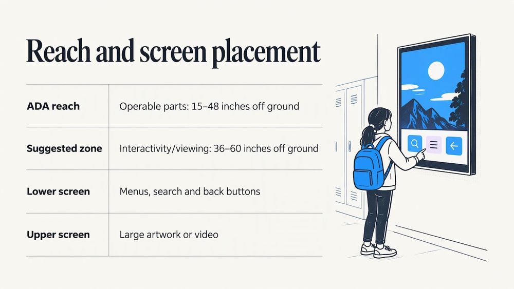
The practical takeaway: put menus, search and back buttons in the lower part of the screen, and let large artwork or video fill the top. Our guide to ADA-compliant kiosks and reach ranges for schools goes deeper on mounting heights and clear floor space.
Environment and hardware: where the design meets the room
A beautiful interface can fail in a bad location. Before you finalize the design, walk the space.
- Lighting and glare. Windows, skylights and overhead fixtures can wash out a screen. Observe the spot at different times of day, and prefer a non-glare screen. How light falls on a space matters for any display, which is why the role of lighting in a space is worth a thought before mounting.
- Traffic flow. Place the screen where people pause, such as near a main entrance, outside the gym or by the trophy cases, and not in a corridor where a crowd creates a bottleneck.
- Viewing distance. Larger screens suit wider spaces. Touchstone offers 55-inch, 65-inch, 75-inch and 100-inch displays, so you can match the size to the room.
- Mounting style. Wall-mounted units save floor space. Floor-standing units are flexible when the wall is not an option.
- Clear floor space. Leave room for a wheelchair user to approach and for a small group to gather without blocking a doorway.
- Network and power. Confirm outlet and network access before installation so content updates arrive in real time.
If you are starting from scratch, our step-by-step guide to setting up touchscreen lobby software covers the setup order. For wayfinding-focused screens, see our piece on the campus directory touchscreen.
Common mistakes to avoid
- Hiding features. Menus that appear only after a swipe or a long press go unused.
- Too much on the first screen. If everything is equally prominent, nothing is.
- Tiny touch targets. Fingers are not cursors. Make buttons large and spaced.
- Long scrolls and deep menus. Visitors will not dig four levels down.
- Inconsistent behavior. A back button that moves around teaches people to distrust the screen.
- No feedback. If a tap has no visible effect, people tap again and again.
- Stale content. An outdated display tells visitors nobody is paying attention.
- Ignoring the room. Glare, awkward height and a crowded corner can sink a good design.
Our perspective on interactive display design
At Touchstone, we believe a recognition display should feel like a school’s best moment, not a spreadsheet on a wall. That is why we start with the story you want to tell and the people you want to honor, and only then talk about screens.
Our team includes gaming industry UI/UX designers, and our work has Emmy-nominated visual design behind it. We bring that background to school halls because the same principles that keep a player oriented in a complex game, such as clear feedback, consistent controls and an obvious next step, keep a visitor oriented in a Hall of Fame.
We build every display to match your school’s identity, from colors and typography to mascots and traditions, because we think recognition feels most meaningful when it looks like it belongs to you. As a family-run business, we work directly with you through design and launch, and our platform is designed to carry no ongoing maintenance costs, with continuous updates and dedicated support.
Our advice is simple: go all in on clarity. Make the first tap obvious, make every profile worth reading and keep adding names. A display that grows with your school becomes part of its culture.
Gardner Gendron
Put these principles to work with Touchstone
If you are planning a digital Hall of Fame, donor wall, record board or archive, we can build the interface and supply the hardware as one bundle. Our Wall Mounted Touchscreen Bundle is priced at $3,100 to $4,900 one-off, and our Floor Standing Touchscreen Bundle at $3,550 to $4,300 one-off. Our touchscreen software is fully customizable, with cloud-based content management and real-time updates.
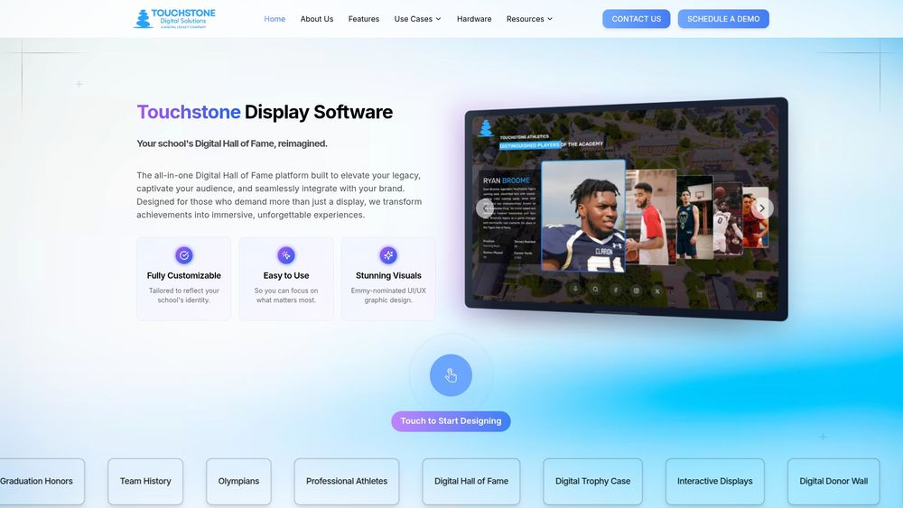
Want to see how your school’s story could look on screen? Visit Touchstone Digital Solutions to start the conversation, or explore our Digital Trophy Case and Digital Donor Walls. For more ideas, our touchscreen display articles and a list of ways schools use interactive touchwalls are good next stops.
FAQ
What are the key principles of interactive display design?
The essentials are perceivability, consistency, affordance and constraint, and feedback. In practice, that means large and legible content, the same behavior on every screen, visible cues for what can be touched, and an immediate response to every tap. For public screens, add zero-trial learning: a visitor should understand the display within seconds.
What touch gestures should a school kiosk support?
Build around single taps and simple horizontal swipes. Offer pinch-to-zoom for archive photos, but pair it with zoom buttons. Research on children’s touchscreen use suggests avoiding double taps for young children and enlarging active areas so near-miss touches still register, so keep gestures consistent and forgiving.
How high should a touchscreen display be mounted?
The ADA sets an unobstructed forward reach range of 15 to 48 inches for operable parts. Place menus, search and back buttons within that range, and use the upper part of a large screen for images and video. Always confirm local requirements for your building.
How should I organize content on a school touchscreen?
Lead with a few featured stories, then give visitors several ways to explore: by name, year, sport, honor and decade. Use one profile template so every entry reads the same way, and assign someone to add new honorees each season.
What mistakes make touchscreens hard to use?
Hidden menus, long scrolling lists, deep navigation, tiny buttons and screens that give no feedback are the usual culprits. Public visitors have little time or reason to learn an interface, so clear and visible controls win.
Sources
- An introduction to interaction design: Design principles (OpenLearn)
- Immediate Usability: Kiosk design principles from the CHI 2001 workshop
- First Principles of Interaction Design (asktog)
- Soni et al. (2019), touchscreen design recommendations for children
- Digital apps and kiosks (Rice Digital Accessibility)
- Accessible Exhibition Design (Smithsonian guidelines)
- Designing for Large Touchscreen Displays (Axiell)
- Guide to the ADA Accessibility Standards, Chapter 3: Operable Parts (U.S. Access Board)
- The role of stage lighting in theatre and live performance